A semi-digital signage system guiding drivers while parking on the street


Hats Worn
UX Researcher • Product Strategist • Graphic Designer • User Testing
Platform
Physical simulation and deliverables
Collaborators
Deepthi Jojy, Tiffany Nguyen and Rebecca Kim
Mentor : Tad Hirsch
Timeline
4 months
Context

Current Painpoints
-
Have to actively search for any vacant spot nearby
-
Confused about multiple signages and pavement markings
-
Timing slots written on some signs are vague
-
Assume there would be a better spot available nearby
-
Have to return to extend parking time
-
Can’t spot and navigate to the exact location of the car after parking it
This led to the problem statement of...
How can we improve the speed of comprehension of street signages for people who drive in the Downtown Boston area?
Design Hypothesis
Drivers in Boston would benefit from semi-digital signage that increases the speed of comprehension related to enforced regulations and hours.
-
During earlier interactions and discussions with our participants, we discovered that there was uncertainty about signage information on enforced regulations and hours.
-
They noted that it was difficult to tell if a parking spot was available and that they wanted to avoid instances of receiving a parking ticket.
This signage redesign might solve the current confusion that exists due to extensive wording and time slots written on a two-dimensional panel.
Design Process : The Phases
🔍 Participant Observation
Develop research question and planning of the activities to study, analyze and observe
🧑🏻 Interview
Conduct, script and transcribe interviews with prospective users using interview guide and recordings
✏️ Synthesis
Identify key stakeholders and develop scenarios that model existing problems and design opportunities
🎨 Precedents
Develop design approaches, create a taxonomy and a collection of relevant design precedents
⏳ Prototyping and Evaluation
Test and iterate different solutions to get a better understanding of the designs
🔍 Participant Observation
-
We spent a day on Newbury St. and Chinatown (one of many busy streets of Boston) to shadow a driver’s parking experience and observe how others handled parking in that area.
-
We discovered that finding a parking spot in downtown is challenging, more so with multiple cars driving slowly through the street to find a place to park.
-
Many drivers drove up to an empty parking spot, showed hesitance, and ended up leaving due to uncertainty about the availability of the spot.

Shadowing
We actively shadowed John throughout the observation as he drove around Newbury St. and Chinatown. In our journals, we documented his journey via recording videos, voice recordings, pictures, and note-taking.
Descriptive Observation
As John’s journey began, his goal was to drive to Newbury St., find a parking spot, and shop around for a while. Afterward, he and his friends left for Chinatown to grab dinner.
Focused Observation
John started facing trouble when finding a parking spot on Newbury St. and Chinatown. Due to one-way streets, he could not detour or make spontaneous decisions while trying to park. He could not read the signages that were on the lamp posts until he approached closer. He also could not find any pavement markings on the street to guide him while parking the car.
Selective Observation
When John found his parking spot, he went to pay for it at the adjacent meter and discovered that the time allotted for that location was 45 minutes to an hour. He continued with his plan to eat dinner with his friends after making the payment.
He did not realize that he had exceeded his parking time (technically losing his parking spot). This was the moment he realized that he should have started a timer upon leaving his spot to be mindful of the time.
🧑🏻 Interview
We further narrowed down our research with a semi-structured interviewing exercise. We interviewed 12 Boston drivers with varied backgrounds and driving experience.
Based on an interviewing guideline, we were able to guide the interviewees toward our domain of interest, while staying open to the unique point of view our participants brought to the table. This proved to be also the most valuable aspect of this process, as the interviewees helped us verify, reevaluate, and expand our initial hypotheses.
The process helped us focus on what currently matters to the drivers and what their struggles are when it comes to parking in Downtown Boston.

Study Overview
Signages
Most interviewees mentioned the difficulty in noticing parking meters and reading signages while they drive. A common pattern in confusion regarding the meaning of some signages (e.g. street cleaning, parking time frames) surfaced in the conversations.
Driving Experience
Most of the time, our participants acknowledged the reason for their parking tickets. They felt frustrated and complained about the complexity of the appeal system. Driving experience varied between different areas. However, some participants expressed a common frustration with one-way street parking, and how they have to circle around multiple times.
Space
Our participants showed having different indicators when they verify the eligibility of a parking spot, which included signages, parking meters, and pavement markings.
Time
Generally, our participants acknowledged the parking time limit for its respective areas. However, the need to keep track of their parking time varied depending on their purpose of trip. The time needed to park their cars in downtown significantly changed between weekday and weekend.
Payment
Mobile applications and credit cards were methods dominantly used among our participants. Some participants shared that they knew other people in the older demographic who prefers using parking meters and paying in coins. Occasional issue with payment method: parking meters and app doesn’t sync as it should.
People
Our participants noticed that the reaction from other drivers on their driving influence the decisions they make when choosing to park in that specific location.
✏️ Synthesis
This exercise undertook several stages of initially identifying our key stakeholders (actors) with their real-world challenges that led us to develop scenarios that model existing problems (barriers) and design opportunities (enablers) that would help them reach their goal when it comes to parking in Downtown Boston.
After getting a realistic understanding of scenarios that showcased the problems people face while driving in Boston, we collectively started brainstorming on how we could help reduce these problems and bring about some changes to better the driving experience.
In order to properly address our audience and use case, we heavily relied on past interview records and external research material and precedents to build our rationale. Utilizing our codebook, each team member came up with possible concepts that identify the problem, which became our ideating stage.
Ideating Design Concepts That Address Design Problems and Selecting A Design Concept
We streamlined our interviewees’ goals which helped us curate our design intervention in relation to the problem we were looking to address.
Our aim was for people driving their car in Boston to easily find and understand appropriate signages and the different types of the parking spots.
With our goal in place, we created several scenarios where our possible design intervention may resolve the issues drivers face as they seek for a parking spot by constantly going back to gathered evidence.

Michelle's Parking Experience Journey Map

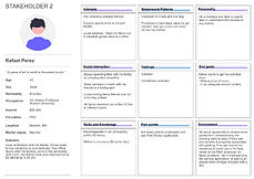
Personas


🎨 Precedents
The precedent research stage is where we identify what makes our approach stand out from past attempts. In this process, we uncovered many sources, ranging from the fundamentals of good signage design and placements to ways that technology has helped revolutionize traffic notations over the years.
Most importantly, we found a great redesign attempt by Sylianteng on NYC parking signages. We also found potent digital signage implementations that highlight information depending on the time of the day. These precedents significantly helped us converge our thought process into taxonomies of “categories” and as an approach that is both feasible and effective.
Precedent Library

Taxonomy - Technology & Automation

Taxonomy - Ergonomic Principles of Sign Design

Taxonomy - Legibility: Font/Size/Color

Taxonomy - Visibility: Distance & Positioning

Taxonomy - Symbols and Signs

Annotated Sketches

⏳ The Solution: Prototyping and Evaluation
We came up with a few ideas including a real-time parking availability application, a heads-up display that can read signages and reflect available parking spots, and a system of digital signages that can show relevant parking information to replace overlapping signs. After much consideration, we went forward with Waypoint - the digital signage redesign, and found interesting ways to build a prototype for this idea.
We tried prototyping static signs shown to real drivers, creating GIF images to show the digital signage in action, and developing a virtual parking simulator to help visualize the drivers’ interaction with the digital signage while driving and trying to park. As shown in class, coming up with these prototypes is a fun way to think about testing the design on a smaller scale.
Upon attempting all four prototypes shown below, the ‘Blue Bikes’ and ‘Online Simulation’ prototypes demonstrated this wasn’t the way to go about testing a change in perception (speed of comprehension) of the redesigned signage. The most appropriate seemed to be giving tasks and goals to real-world drivers in a real-life setting, behind the wheels of a car. Had the sign been a semi-digital signage as proposed, we wondered about the chances of better recognition from afar and a positive interaction with the signage itself.

🚘 Virtual Parking Simulator: App Interface and Results


👩🏻💻 Reflections Post-Critique
Results:
After we conducted the in-class simulation activity, some of our observations were:
-
Our participants started understanding the signage through color and this brought to light a repeated pattern in the exercise.
-
It was their automatic response to answer ‘yes’ if the signage was green and to answer ‘no’ if the signage was red.
-
There were instances when the participants got distracted by the countdown bar, date, and time showcased throughout the entire interface of the simulation.
Reflections:
During the design critique, conversations below surfaced:
-
How our design should be inclusive and accessible for anyone who would see the signage. In a color blindness detector test, we realized how people with red blindness would not be able to differentiate between the two signs whose purpose is completely different.
-
How we should work with different elements of the signage and not focus solely on color and contrast.
This allowed us as a group to realize that there are limitations to each simulation activity and we should always try and test different methods to understand what works in our design and can be improved and included/excluded to increase the speed of comprehension for drivers in Boston.
